Milankovitch cycles
Contents
Milankovitch cycles#
Dynamic Earth and Planets Stratigraphy (Year 1) High-Temperature Geochemistry Climate Gravity, Magnetism, and Orbital Dynamics
Milankovitch cycles are the effects of changes in Earth’s movements on Earth’s climate over thousands of years.
In 1920s, Serbian geophysicist and astronomer Milutin Milanković hypothesised that eccentricity, obliquity (axial tilt) and precession cause cyclical variations in solar radiation reaching Earth and influence climate patterns.
Theory#
(1) Eccentricity (\(e\)) - this parameter describes how circular an orbit is:
\(e=0\) - ciruclar orbit
\(0<e<1\) - elliptic orbit
\(e = 1\) - parabolic trajectory
\(e>1\) - hyperbolic trajectory
Most bodies in solar system have \(e \ll 1\). Pluto and Mercury have \(e=0.25\) and \(e=0.21\). For eliptical orbits, the eccentricity can be calculated with periapsis and apoapsis:
where \(r_p=a(1-e)\), \(r_a=a(1-e)\) and \(a\) is the semi-major axis:

For Earth, the eccentricity varies between \(0.0034\) and \(0.058\) and is almost circular. The variations take place in \(95,000\) and \(125,000\) year cycles with beat period of \(400,000\) years. They loosely combine into \(100,000\) year cycles. Earth’s eccentricity changes are caused primarily by perturbations from Saturn and Jupiter.
(2) Obliquity - obliquity is the angle at which the Earth is titled to the ecliptic plane.
Due to gravitational perturbations, primarily from Saturn and Jupiter, it varies between \(22.1^\circ\) and \(24.5^\circ\). Increased obliquity causes more pronounced seasonal differences in temperatures. On Earth, obliquity changes in \(41,000\) year cycles.
(3) Precession - precession refers to direction of rotation axis and looks like a spinning top toy.
Precession on Earth takes \(21,000\) year cycles. Axial precession makes contrasts in extremes between hemisphere. It also gradually changes when seasons start.
Plotting Milankovitch cycles in time#
Orbital forcing data can be downloaded from here based on Laskar et al. (2004) paper “A long term numerical solution for the insolation quantities of the Earth”.
The dataset coprises of:
time - in thousands of years from present
eccentricity - calculated with \(\frac{r_a-r_p}{r_a+r_p}\)
obliquity - angle in radians
perihelion - angle between equinox & perihelion in radians
insolation - at \(65^\circ N\) at summer solstices (\(W/m^2\))
global insolation - solar flux in \(W/m^2\)
import pandas as pd
import numpy as np
import matplotlib.pyplot as plt
data = pd.read_csv("data/milankovitch.csv")
data.head()
| time | eccentricity | obliquity | perihelion | insolation | global_insolation | |
|---|---|---|---|---|---|---|
| 0 | -20000 | 0.028373 | 0.413422 | 3.641942 | 511.372693 | 342.087719 |
| 1 | -19999 | 0.027002 | 0.412171 | 3.927210 | 515.449123 | 342.074725 |
| 2 | -19998 | 0.025691 | 0.410716 | 4.214007 | 517.235678 | 342.062901 |
| 3 | -19997 | 0.024361 | 0.409094 | 4.498755 | 516.561670 | 342.051515 |
| 4 | -19996 | 0.022902 | 0.407352 | 4.783758 | 513.516924 | 342.039710 |
The data does not contain precession. To display precession, we can use precession index calculated via:
where \(\varpi\) is the perihelion given in the database.
data["precession_index"] = data.eccentricity*(np.sin(data.perihelion))
Apart from orbital forcing, we can also plot some isotope data to find whether orbital cycles are reflected in data.
In this example, we downloaded composite antarctic ice core data with \(CO_2\) record for past \(800,000\) years compiled by Bereiter et al. (2015). The data is available from NOAA and can be downloaded here.
antarctica_data = pd.read_csv('data/antarctica_co2_composite.csv')
antarctica_data.head()
| age_gas_calBP | co2_ppm | co2_1s_ppm | |
|---|---|---|---|
| 0 | -51.03 | 368.02 | 0.06 |
| 1 | -48.00 | 361.78 | 0.37 |
| 2 | -46.28 | 359.65 | 0.10 |
| 3 | -44.41 | 357.11 | 0.16 |
| 4 | -43.08 | 353.95 | 0.04 |
Now, having both datasets we can plot on the same graph precession index, obliquity, eccentricity, insolation and \(CO_2\) record from Antarctica:
fig, axes = plt.subplots(5,1, figsize=(7,7), sharex=True)
ax1 = axes[0]
ax2 = axes[1]
ax3 = axes[2]
ax4 = axes[3]
ax5 = axes[4]
ax1.plot(-data.time, data.precession_index, color="#4dd327ff")
ax2.plot(-data.time, np.rad2deg(data.obliquity), color="#00bfffff")
ax3.plot(-data.time, data.eccentricity, color="#ff981cff")
ax4.plot(-data.time, data.insolation, color="#6931dfff")
ax5.plot(antarctica_data.age_gas_calBP/1000., antarctica_data.co2_ppm, color="#eb3d4eff")
ax1.set_title(r"Precession index ($e\times\sin{\varpi}$)")
ax2.set_title("Obliquity")
ax3.set_title("Eccentricity")
ax4.set_title("Mean daily insolation at 65$^\circ$N on summer solstice")
ax5.set_title("CO$_2$ (ppmv) from Bereiter et al. (2015)")
ax1.set_ylabel("")
ax2.set_ylabel("Degrees ($^\circ$)")
ax3.set_ylabel("")
ax4.set_ylabel("$W/m^2$")
ax5.set_ylabel("CO$_2$ (ppmv)")
for ax in axes:
for i in range(8):
ax.axvline(100+100*i, color='gray', dashes=(4,2), lw=1)
plt.xlim(0, 800)
plt.subplots_adjust(hspace=0.4)
plt.xlabel("kyr ago")
plt.show()
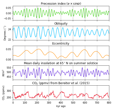
Looking at the graph, we can see that \(CO_2\) peaks align with peaks in eccentricity, at \(\sim 100,000\) years intervals. Additionally, higher changes in insolation correlate with higher precession index.
Interactive plot of the orbital cycles#
from plotly.subplots import make_subplots
import plotly.graph_objects as go
fig = make_subplots(rows=4, cols=1, shared_xaxes=True)
fig.add_trace(go.Scatter(x=data.time, y=data.precession_index,
name="Precession Index",
line=dict(color="limegreen", width=1.5)), row=1,col=1)
fig.add_trace(go.Scatter(x=data.time, y=data.eccentricity,
name="Eccentricity",
line=dict(color="cyan", width=1.5)), row=3,col=1)
fig.add_trace(go.Scatter(x=data.time, y=np.rad2deg(data.obliquity),
name="Obliquity",
line=dict(color="orange", width=1.5)), row=2,col=1)
fig.add_trace(go.Scatter(x=data.time, y=data.insolation,
name="Mean daily insolation at 65N on summer solstice",
line=dict(color="orchid", width=1.5)), row=4,col=1)
fig.update_layout(xaxis_rangeslider_visible=False,
legend_orientation="h",
xaxis4_title='Kiloyears from present',
plot_bgcolor="white",
title="Milankovitch forcing throughout geological history")
fig.update_yaxes(title="", row=1, col=1, fixedrange=True)
fig.update_yaxes(title_text=r"Degrees",
row=2, col=1, fixedrange=True)
fig.update_yaxes(title="",
row=3, col=1, fixedrange=True, range=[-0.1,0.1])
fig.update_yaxes(title_text=r"W/m^2",
row=4, col=1, fixedrange=True)
fig.show()